ครูว์ : เบนท์ลีย์ มอเตอร์ส เผยโฉมโลโก้ใหม่ ‘Bentley Wings’ กับก้าวแรกในการผลิกโฉมการออกแบบสู่อนาคตของแบรนด์รถยนต์สัญชาติอังกฤษ โลโก้ ‘Winged B’ ใหม่นี้ถือเป็นวิวัฒนาการการออกแบบครั้งที่ 5 ในประวัติศาสตร์ 106 ปีของแบรนด์ และจะเปิดตัวอย่างเป็นทางการพร้อมกับรถยนต์ต้นแบบรุ่นใหม่ในวันที่ 8 กรกฎาคมนี้ ซึ่งเป็นช่วงเดียวกับวันเปิดสตูดิโอออกแบบแห่งใหม่ที่โรงงานเบนท์ลีย์ มอเตอร์ส เมืองครูว์ ประเทศอังกฤษ
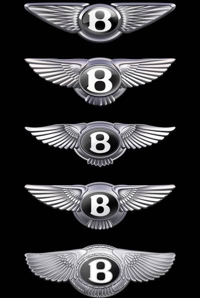
โลโก้ ‘Winged B’ แบบดั้งเดิมนั้นออกแบบโดย F. Gordon Crosby ในปี 2462 และได้มีการปรับเปลี่ยนเรื่อยมาในปี 2474 ปี 2533 และ ปี 2545 จนกระทั้งในปี 2568 ซึ่งถือเป็นการเปลี่ยนแปลงครั้งใหญ่ที่สุดในประวัติศาสตร์กว่าศตวรรษที่ผ่านมา การออกแบบโดยทีมออกแบบของเบนท์ลีย์ภายใต้การกำกับดูแลอย่างใกล้ชิดของ Robin Page ผู้อำนวยการฝ่ายออกแบบ โลโก้ Winged B ใหม่นี้จะเป็นก้าวแรกสู่อนาคตของแบรนด์รถยนต์เบนท์ลีย์ โดยโลโก้ใหม่ได้รับการออกแบบด้วยความตั้งใจ ความเอาใจใส่ และความคิดสร้างสรรค์ ถือเป็นสัญลักษณ์แห่งอนาคตที่น่าตื่นเต้นของแบรนด์รถยนต์สัญญาติอังกฤษนี้
สำหรับโลโก้ใหม่จะเปิดตัวอย่างเป็นทางการพร้อมกับรถยนต์ต้นแบบแห่งอนาคตรุ่นใหม่ ซึ่งถือเป็นการเริ่มต้นแนวคิดด้านการออกแบบรถยนต์เบนท์ลีย์ยุคใหม่ โดยรถยนต์ต้นแบบดังกล่าวมีกำหนดการเปิดตัวในวันที่ 8 กรกฎาคมนี้ ซึ่งถึงแม้ว่ารถยนต์ต้นแบบที่ได้รับแรงบันดาลใจจากรถยนต์เบนท์ลีย์รุ่นไอคอนนิกในอดีตจะไม่ได้มีจุดประสงค์เพื่อการผลิต แต่จะเป็นการบ่งบอกถึงทิศทางของแบรนด์รถยนต์เบนท์ลีย์ในอนาคต
Robin Page ผู้อำนวยการฝ่ายออกแบบ เบนท์ลีย์ มอเตอร์ส กล่าวว่า “หากแบรนด์หรูเป็นผลผลิตจากเรื่องราวที่สร้างสรรค์ขึ้น โลโก้ก็ถือเป็นลายเซ็นของแบรนด์นั้นเอง ในประวัติศาสตร์กว่าศตวรรษที่ผ่านมา นี่เป็นการผลิกโฉมการออกแบบครั้งที่ห้าของ Winged B อันโด่งดังของเบนท์ลีย์ การออกแบบใหม่ถือเป็นงานยากที่เราใส่ใจอย่างมาก ในโลกยุคดิจิทัลที่ซับซ้อน การทำให้เรียบง่ายและประณีตจึงเป็นสิ่งสำคัญ ดังนั้น โลโก้ใหม่จึงดูเรียบ คมชัด และสื่อสารภาพลักษณ์ได้ดีกว่ารุ่นก่อน โลโก้ Winged B และรถยนต์ต้นแบบใหม่ที่กำลังจะเปิดตัว จึงล้วนเป็นสัญลักษณ์ของอนาคตที่ทรงพลังและน่าตื่นเต้นของแบรนด์ที่จะมาพร้อมกับสุดยอดยนตรกรรมที่ถูกรังสรรค์ขึ้นด้วยงานฝีมือ”
โลโก้ Winged B ใหม่
การออกแบบ Winged B ใหม่ที่นำโดย Robin Page ได้รับการสนับสนุนจากทีมงานภายในของเบนท์ลีย์ มอเตอร์ส โดยในช่วงแรกมีการจัดการแข่งขันการออกแบบขึ้น โดยให้ทีมออกแบบทั้งหมดส่งแนวคิดและแบบร่าง สำหรับผลงานการออกแบบที่ได้รับการคัดเลือกนั้นได้รับการเสนอโดย Young Nam เป็นสมาชิกของทีมออกแบบภายใน จากนั้นแนวคิดนี้จึงได้รับการพัฒนาและลงรายละเอียดสู่รูปแบบล่าสุด
ภารกิจในการออกแบบโลโก้ใหม่ คือ การนำรายละเอียดอันงดงามบางส่วนจากงานออกแบบโลโก้รูปแบบก่อนมาใช้ เช่น ลวดลายเพชรของปีกด้านในและอักษรรูปตัว “B” ตรงกลางที่มีการออกแบบใหม่ให้ดูร่วมสมัยยิ่งขึ้น
การออกแบบรูปร่างของปีกใหม่จะเน้นความคมชัดและโดดเด่นกว่ารูปแบบก่อน โดยชวนให้นึกถึงปีกทรงมุมแหลมของเหยี่ยวเพเรกริน โดยขนส่วนล่างใต้ปีกอักษรรูปตัว “B” ได้ถูกนำออกทั้งหมดเพื่อให้ดูสะอาดตาขึ้น
ตรงกลางของปีกยังคงมีอักษรรูปตัว “B” ประดับอยู่ แต่ได้รับการออกแบบใหม่เพื่อให้สามารถแยกเป็นภาพกราฟิกโลโก้เดี่ยวโดยที่ไม่ต้องมีปีกได้ ซึ่งตัวอักษรรูปตัว “B” ได้รับการออกแบบเพื่อให้เก็บรายละเอียดตามที่เห็นในงานออกแบบนาฬิกาหรู เช่น ขอบกระจกและขอบโลหะกับความลึกแบบ 3 มิติของตัว “B” ใต้พื้นผิว
เรื่องราวโลโก้ Winged B
องค์ประกอบต่างๆ ของโลโก้แบรนด์รถยนต์เบนท์ลีย์ยังคงความเป็นเอกลักษณ์เสมอมา นั่นคืออักษรรูปตัว “B” ที่โดดเด่นอยู่ตรงกลางของโลโก้ขนาบด้วยปีกนกสองข้าง ในช่วงที่ W.O. Bentley ก่อตั้งบริษัทผลิตรถยนต์ในปี 2462 เขาต้องการโลโก้ที่สะท้อนถึงการผลักดันขีดจำกัดด้านสมรรถนะ W.O. Bentley จึงได้ร่วมมือกับ F. Gordon Crosby ผู้มีชื่อเสียงในวงการสื่อด้านยานยนต์ช่วงก่อนสงครามโลก และได้นำการแข่งขันรถยนต์ทางไกลข้ามทวีปกลับมาให้ผู้อ่าน The Autocar อีกครั้ง Crosby ได้ออกแบบ Winged B แบบดั้งเดิม โดยมีอักษรรูปตัว “B” ของเบนท์ลีย์อยู่ภายในปีกคู่หนึ่งที่เลือกมาเพื่อแสดงถึงอารมณ์ความตื่นเต้นเร้าใจ หรืออีกนัยหนึ่ง คือ ภูมิหลังของ W.O. Bentley ในฐานะวิศวกรนักออกแบบเครื่องยนต์สำหรับเครื่องบินรบในช่วงสงครามโลกครั้งที่หนึ่ง Crosby ให้ปีกแต่ละข้างมีขนนกจำนวนต่างกันเพื่อให้มีเอกลักษณ์เฉพาะตัว และเพื่อให้ยากต่อการลอกเลียนแบบ
ในช่วงเบนท์ลีย์อยู่ภายใต้การดูแลของโรลส์-รอยซ์ในปี 2474 โลโก้ใหม่จึงได้ถูกคิดค้นขึ้น โลโก้รุ่นที่สองนี้มีลักษณะสมมาตร โดยมีขนนกที่ยืดตรง 10 เส้นต่อด้าน ขนาบข้างอักษรรูปตัว “B” ที่เรียบง่ายในวงรีสีดำ โลโก้รุ่นนี้ถือเป็นรุ่นที่มีการใช้งานมายาวนานที่สุดในประวัติศาสตร์ของแบรนด์รถยนต์เบนท์ลีย์ โดยยังคงใช้มาจนกระทั่งมีการแก้ไขโลโก้ครั้งที่สามในช่วงปี 2539 ซึ่งเมื่อมีการแก้ไขตัวอักษรรูปตัว “B” ตรงกลางเพื่อเป็นการยกย่อง Crosby และเพื่อให้สอดคล้องกับโลโก้แบบดั้งเดิม ตราโลโก้และส่วนโค้งของปีกจึงได้รับการเน้นให้เด่นชัดขึ้น
หลังจากที่ Volkswagen Group เข้าดูแลเบนท์ลีย์ในปี 2541 โลโก้ดังกล่าวก็ได้รับการออกแบบใหม่สำหรับรถยนต์ระดับไอคอนนิก รุ่น Continental GT รุ่นแรกที่เปิดตัวในปี 2545 สำหรับยุคใหม่ของเบนท์ลีย์ที่นำโดยรุ่นเรือธงอย่าง Continental GT ซึ่งเป็นรถยนต์เบนท์ลีย์ที่มียอดผลิตเพิ่มขึ้นจาก 1,000 คันเป็น 10,000 คันต่อปี โลโก้ Winged B จึงได้รับการออกแบบใหม่ และเพื่อเป็นการยกย่องรถยนต์รุ่นดั้งเดิมในปี 2462 โลโก้ Winged B ใหม่จึงได้กลับมาใช้งานออกแบบที่ไม่สมมาตร โดยมีขนนก 10 เส้นในปีกด้านซ้ายและ 11 เส้นในปีกด้านขวา โลโก้ Winged B รุ่นนี้จึงได้ถูกใช้เป็นโลโก้หลักของแบรนด์รถยนต์เบนท์ลีย์นับตั้งแต่นั้นเป็นต้นมา
โลโก้ Winged B ใหม่ ปี 2568 จะใช้สำหรับการเปิดตัว 2 ครั้งในสัปดาห์หน้า โดยครั้งแรกจะเป็นการเปิดตัวอย่างเป็นทางการ ณ โรงงานเบนท์ลีย์ มอเตอร์ส เมืองครูว์ ประเทศอังกฤษในวันจันทร์ที่ 7 กรกฎาคมนี้ ซึ่งเป็นส่วนหนึ่งของการเปิดตัวสตูดิโอออกแบบอันทันสมัยแห่งใหม่ของเบนท์ลีย์ โครงการพัฒนาอาคารสูง 3 ชั้นนี้สร้างขึ้นภายในอาคารสำนักงานใหญ่เดิมของโรงงานที่สร้างขึ้นครั้งแรกในปี 2481 และการเปิดตัวครั้งที่ 2 ในวันอังคารที่ 8 กรกฎาคมนี้จะเป็นการเผยโฉมพร้อมกับรถยนต์ต้นแบบรุ่นใหม่ที่จะถือเป็นรถยนต์เบนท์ลีย์รุ่นแรกที่จะมีการตกแต่งด้วยโลโก้ Winged B ใหม่นี้
Bentley’s vision of the future reveals New Wings
– Bentley Motors unveils contemporary new emblem, teasing a new concept car to be revealed on 8 July
– Only the fifth iteration of the Bentley emblem in 106-year history
– New emblem designed entirely in-house, curated by Director of Design Robin Page
– Modern development of original 1919 design by F. Gordon Crosby
Crewe : Bentley Motors has unveiled a new ‘Bentley Wings’ emblem – the first step of a design and brand revolution at the British marque. The new ‘Winged B’ is just the fifth iteration in Bentley’s 106 year history and will be previewed with the reveal of a future vision concept car on 8 July, coinciding with the opening of a new Design Studio at its headquarters in Crewe, England.
The original ‘Winged B’ design was created by F. Gordon Crosby in 1919. Developments followed in 1931, the 1990s and 2002, but the new 2025 design is the biggest change to the instantly-recognisable mark in more than a century of history. Created in-house by Bentley’s own design team under the watchful eye of Director of Design Robin Page, the new Winged B is the first step of the next chapter for the Bentley brand and its DNA. Crafted with confidence, care and creativity, the new emblem is symbolic of an exciting future for Bentley.
The new emblem has been revealed on the front of an as-yet unseen new future vision concept car, which in turn heralds the start of a new era of Bentley design language. Set to be revealed next week on 8 July, the concept – while not production intent – gives a hint of the direction in which Robin will be leading Bentley design for a new line-up of products in the future, inspired by an iconic Bentley of the past.
The new Winged B
The design of the new Winged B was led by Robin Page, supported by a small and dedicated internal team. Initially, a competition was run, allowing the entire design team to submit concepts and sketches. The final design chosen was proposed by Young Nam, a member of the Interior Design team, and that concept was then developed and detailed into the final version.
The mission in designing the new emblem was to capture some of the beautiful details from the previous designs – for example, the diamond pattern of the inner wings and the B ‘centre jewel’ – but create a more modern and progressive design.
The shape of the new wings themselves are sharper and more dramatic than the outgoing version – more reminiscent of the angled wings of a Peregrine Falcon than the previous softer shapes. The lower feathers underneath the B have been removed entirely, for a visually-cleaner shape.
The centre of the wings retains the B centre jewel, but redesigned in such a way that the device can stand alone and be used as a graphic without the wings. The jewel has been redesigned to capture the high quality details seen in luxury watch design, including a bevelled glass edge and chamfered metal surround, with a 3D depth of the “B” below the surface.
Bentley’s Director of Design, Robin Page, comments:
“If a luxury brand is the product of the stories it has created, then its emblem is its signature. In more than a century of history, this is only the fourth evolution of Bentley’s iconic Winged B, and redesigning it was a formidable task for which we’ve taken great care. In an era of ever-increasing complexity and fidelity from digitalisation, an exercise of simplification and refinement is a modern necessity – and so the new emblem is cleaner, sharper and more impactful than its predecessor. The new Winged B – and the concept car that introduces it – both symbolise a powerful, exciting future for this company and its exceptional, handcrafted products.”
The History of the Winged B
The elements of the Bentley iconography have always been the same – a prominent B at the heart of the design, flanked by a pair of feathered wings. When W.O. Bentley started his car company in 1919, he needed an emblem that summed up his quest to push the boundaries of performance. He turned to his friend F. Gordon Crosby, the most famous motoring artist of the pre-war years, who brought distant motor races and continental tours to life for readers of The Autocar. Crosby created the original Winged B – with the ‘B’ of Bentley inside a pair of wings chosen to represent the exhilaration of motion – and perhaps also a reference to W.O. Bentley’s background as a designer of engines for fighter planes in the First World War. Crosby gave each wing a different number of feathers to make it completely unique – and stay one step ahead of fraudulent imitations.
When Bentley passed into the ownership of Rolls Royce in 1931, a new emblem was created. This second iteration was symmetrical, with 10 straightened feathers each side, flanking a simpler B in a plain black oval. This version is the longest-standing example in the company’s history, in use until the emblem’s third revision in circa 1996 – when, as a nod to Crosby the central ‘B’ was revised to echo the original, the emblem became more ornate and more pronounced curvature returned to the wings.
Following the purchase of Bentley by the Volkswagen Group in 1998, the emblem was redesigned again in preparation for the first Continental GT, launched in 2002. For the new era of Bentley ushered in by the Continental GT – a car that took annual production from 1,000 cars to 10,000 – a new Winged B was created. This honoured the 1919 original by reverting to an asymmetric design, with 10 feathers to the left an 11 to the right. This Winged B has been in use ever since as the main identity of Bentley.
Bentley’s 2025 Winged B will have two debuts next week. First, it will be officially unveiled at Bentley’s campus in Crewe, England on Monday 7th July, as part of the opening of Bentley’s new, state-of-the-art Design Studio. This three-storey development has been created within the original headquarters building of the factory, first built in 1938. On Tuesday 8th July, the new concept car will be revealed, as the first Bentley model to wear the new wings. Details will be announced via press release and on www.bentleymedia.com.